Your Cheating Chart (from the Journal of Accountancy)
To paraphrase the country western song, your cheating chart is going to tell on you!
Fellow CPA Carlton Collins shows common ways that data presentation via charts can be unethically manipulated to change the reader’s conclusions
Don’t be fooled by government (or other) data that sounds too good to be true.
Learn to be discerning and always watch the X-axis and the time frame.
See if you can spot how the charts below have been changed for more favorable results.
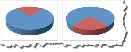
Rotating 3-D charts. The two charts shown below are identical, except for rotation. The red pie slice facing forward covers 107% more area (graphically) than the pie slice facing the rear. This technique might subliminally give the impression that the red pie slice represents a larger or smaller portion of the pie, depending upon your perspective.

Cone charts. The two charts atop the next column are identical, except for the “cone” effect. Notice in the 3-D bar chart on the left, meals and entertainment expenses appear to represent a significant portion of the total travel expenses. However, in the cone chart on the right, meals and entertainment expenses visually appear to represent a much smaller fraction of the total travel expenses.

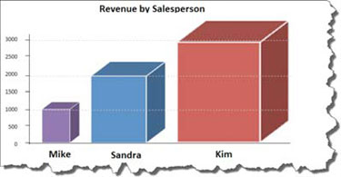
Picture charts. The chart below shows sales results for three salespersons. The chart shows that the third salesperson generated three times the amount of sales of the first salesperson ($3,000 compared with $1,000). Reading the chart based on data bar height, the chart reads accurately. However, because the data bars in the chart are taller and wider, the third data bar covers nine times the surface area of the first data bar, thus creating the illusion that sales were nine times higher.

Distorted line charts using 3-D and rotation. The three charts below depict the same data. The first chart is a two-dimensional line chart, which suggests an overall downward trend in the data. The second chart is also a two-dimensional line chart, but the maximum value on the Y-axis has been increased tenfold compared to the first chart, thus flattening the line and suggesting that there is not much of a trend in the data. The third chart is a 3-D line chart, which has been rotated forward to emphasize the increase at the end of the chart. This third chart might give more of an impression that results are trending upward.

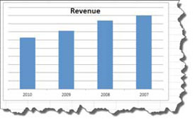
Reverse order charts. In the chart on the next page, the data are displayed chronologically from right to left. In this example, revenue has actually declined over the past three years; however, since most people read charts from left to right, they might miss the fact that the data is presented in the opposite direction.

3-D bar charts. The two charts below are identical, except for the 3-D effect. Notice that in the 3-D chart, the third data bar representing 4,000 does not appear to reach the 4,000 hash mark on the Y-axis. By comparison, the same data bar displayed in a two-dimensional version of the chart does perceptibly touch the 4,000 hash mark. (The reason for this distortion is that the front of the 3-D bar lines up with the Y-axis labels on the left side of the chart, but the data bar’s depth is not as great as the 3-D chart’s depth.)

