The other side of the coin
 After 172 posts and 81 pages written and published on our site, nothing has drawn the reaction of this post entitled Who pays the Federal Income Tax.
Given that the stats quoted were from the IRS, you’d think that no one could argue about an empirical fact (the top 10% pay over 70% of the total income tax) of who pays how much of the income tax. Surprisingly more vitriol, name-calling, etc. arose over the above-linked post than any other. [Editor’s note-These were from non-clients and a particular Atlanta attorney.]
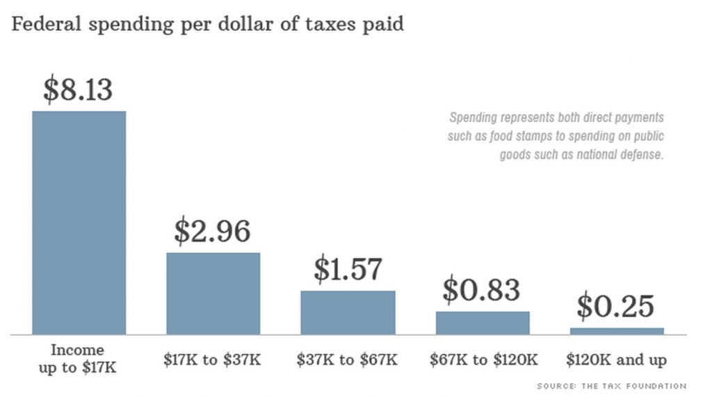
In an effort to provide data for these information-challenged voters, I thought it would be helpful to talk about the other side of the coin. Instead of focusing on the fact that the bottom 50% of earners pay almost nothing (about 2% of the total) in income tax, let’s look at who gets how much of all the Federal money spent by income level. The chart below was published by CNN on their financial website.
 |
| To quote the CNN authors, “The broad takeaway: The bottom 60% of Americans receive more from government spending than they pay in taxes, and the top 40% get less from government spending than they pay. Spending represents everything from direct federal payments such as those for food stamps, Social Security and farm subsidies to spending on public goods intended to benefit everyone such as national defense, education and highways.”So to our friends who debated the IRS stats above, do you still want to argue that the rich don’t pay a fair share? If so, your comments are welcome below. |